Many small and medium sized companies store their employee roster in Google Sheets. It is a cost-effective way to manage until the size of the company gets larger and requires the investment into larger tools such as an HRMS. While an employee roster is great as a list of employees and their data, it helps to have a visual org chart. There are other very interesting uses of an org chart apart from visualizing your own company hierarchy.
Google Sheets has a in-built chart option to create an org chart. This article will show you how you can make the best org chart possible with Google Sheets Org Chart. We will use the OrgNice Google Sheets template for Org Chart as the source of data. The data we will use in this guide is organization hierarchy of the Dunder Mifflin Paper Company from the show “The Office”. We will also discuss limitations, and potential workarounds where possible.
Goal
This is the Org Chart we are aiming to create -

Let’s get started.
Data Description
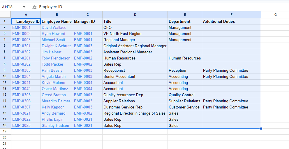
A typical org chart in Google Sheets requires just two columns -
ID- A unique way to identify employees (such as an id or email or anything else that works)Parent- A reference to the manager/supervisor or the person that the employee reports to. This also an ID and must be one of the values from the ID list because the parent is also an employee.
The OrgNice Google Sheets template for Org Charts has the following columns -
Employee ID(the unique id of each employee in the company)Employee Name(the name of the employee)Manager ID(the id of the employee’s manager - the value has to be one of the values in the Employee ID column - i.e. the manager is also an employee)- Additional fields like
Title,Department, etc
This is a great starting point for us to build out our org chart. Feel free to use the example file linked in OrgNice Google Sheets template for Org Charts for your own org charts.
Step 1 - Create the basic chart
- Copy the data from the OrgNice Google Sheets template for Org Charts to your own Google Sheets file.
-
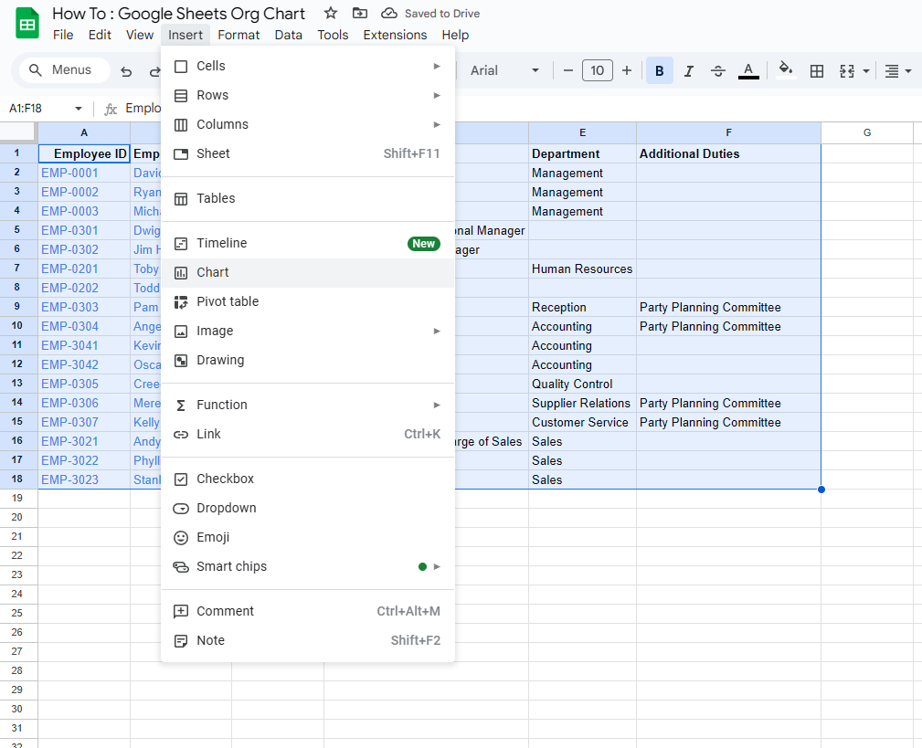
Select the entire data and then do Insert > Chart
-
In Chart Type pick ‘Organizational Chart’
-
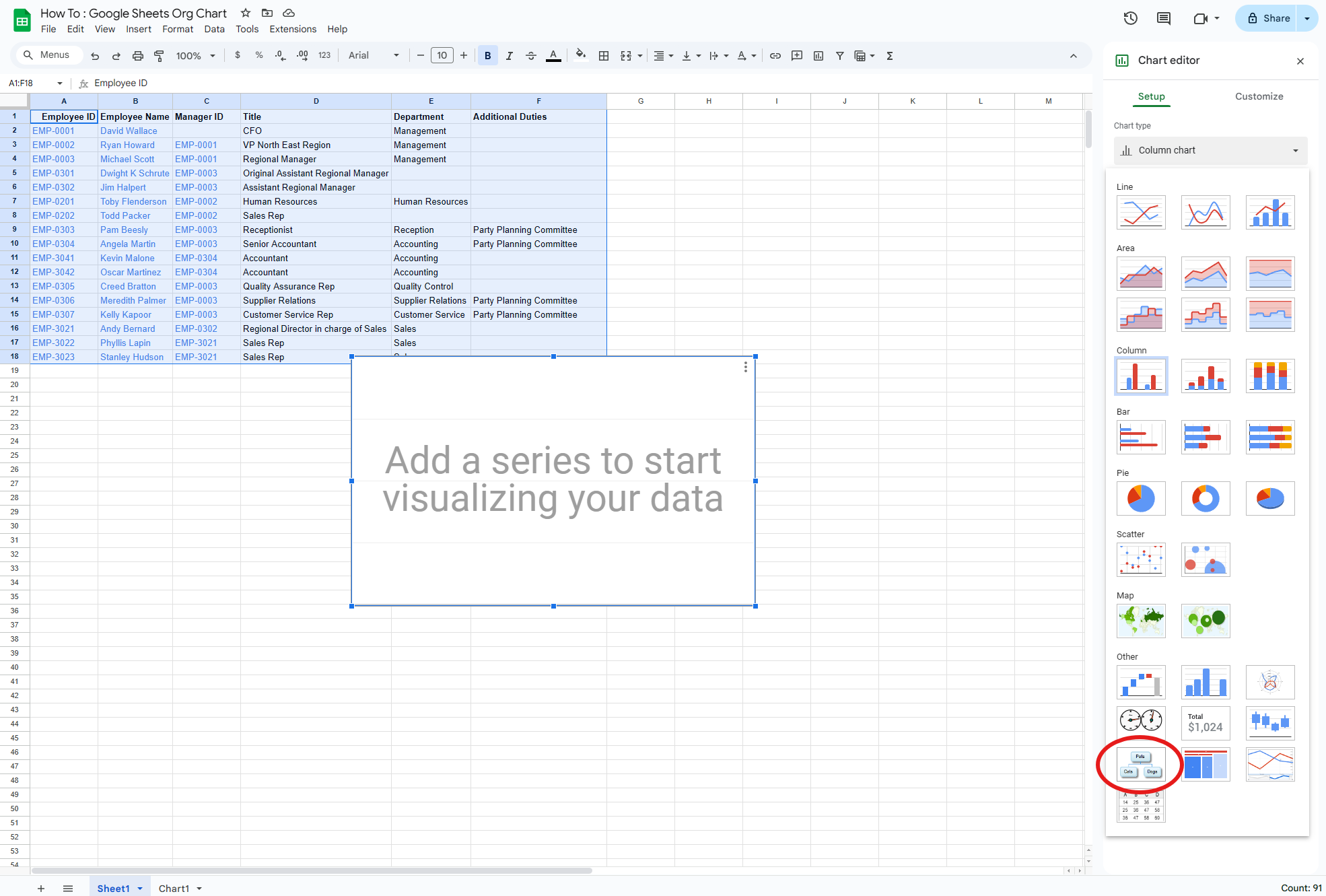
By default, Google Sheets will perform some mapping but it may not be right. What we are trying to do here is pick the
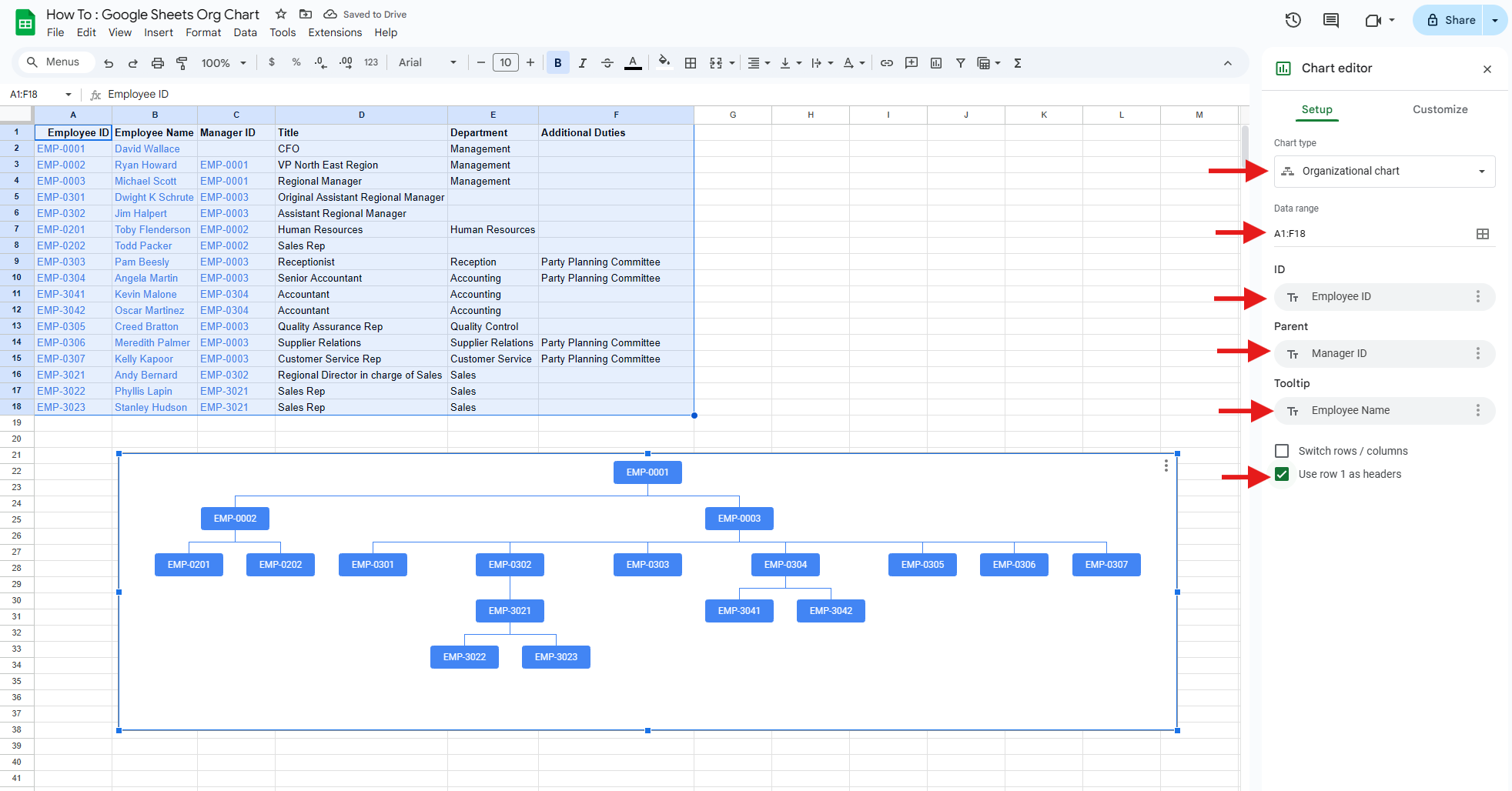
IDand theParentand map them toEmployee IDandManager ID. Our sheet already has these columns so that should be easy. First we need to tell Google Sheets that we have a header row - so assuming your sheet looks the same you can check -Use row 1 as header -
Now we see
IDmapped toEmployee IDandParentmapped toEmployee Name. TheIDmapping is correct but theParentmapping is not. Let’s change that toManager ID. -
Our chart looks like this one now. Stretch the chart so you can see it better.
-
That’s not bad! You can change the Tooltip to be
Employee Nameso when you hover over the nodes, you can see the name.
However, in my opinion, this is not very usable. It is visual but it lacks enough information to really provide the advantages of Org Charts. Also, it doesn’t look like our target image above, so let’s try to make things a little better.
Step 2 - showing names
We would like to show the names of the employee in the box instead of just in the tool tip when we hover.
Option 1
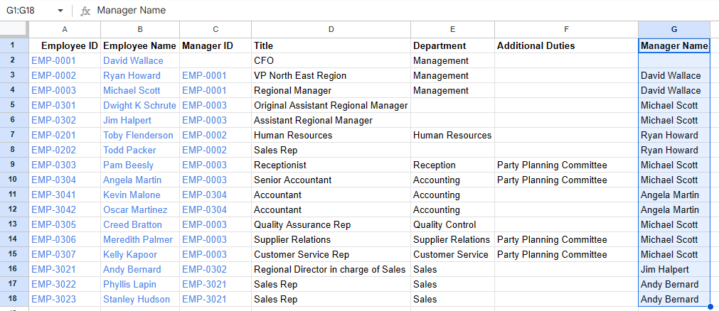
We could try changing the mapping of ID to Employee Name instead of Employee ID but that does not work because it violates the constraint that the Parent must be from the same list as the ID. We will then need to add a Manager Name column that we can map Parent to. This is not too hard to do so let’s add a formula to get the Manager’s name instead of the id.
- Add a column
Manager Name - Add this formula
=IFERROR(VLOOKUP(C3, A:B, 2, FALSE), "")to the 3rd row of theManager Namecolumn. If you are not familiar with VLOOKUP, what this forumla does is to take the manager’s id and then look up the manager’s name from the correct row. Apply this to all cells of theManager Namecolumn. The data now looks like this and you can see that the Manager Names are correct.
- Edit the org chart mapping - you can double click on the chart or choose Edit from the top right menu on the chart.
- Change the Mappings to be
ID->Employee NameandParent->Manager Name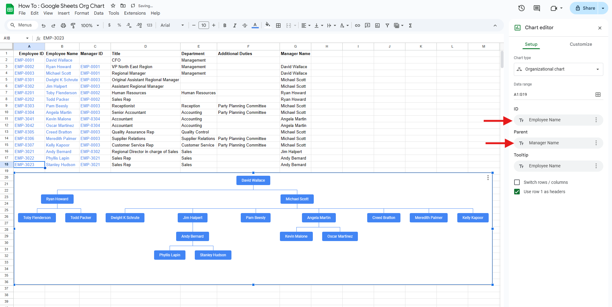
That looks a lot like what we wanted. We don’t see the ids anymore though but the names are easier to read. This approach, however, has an issue when we have people with the same names in the organization. Google Sheets will not be able to map them correctly and will skip duplicate employee names which is not what we want. You can try this yourself by editing cells to have the same names.
Option 2 - Add additional details
We could use the same trick as Option 1 but make the entries as unique as they were originally with Employee ID. For this we will combine the Employee ID and the Employee Name into another unique column that has both pieces of data. To do this these are the steps -
- Make sure you retain the
Manager Namecolumn from Option 1 - this is in column G - Add a column named
Employee Details - Use the following formula for populating
Employee Details. This formula is applied to row 2 and then copied to the rest of the rows -=A2 & CHAR(10) & B2 - Add a column named
Manager Details - Use the following formula for populating
Manager Details. This forumla is applied to row 2 and then copied to the rest of the rows -=C2 & CHAR(10) & G2 - The CHAR(10) introduces a new line to make it easier to read - you can choose to replace it with anything else such as
David Wallace [EMP-0001]but whatever you choose to do you must make sure that theManager Detailsvalues are present inEmployee Details - The sheet looks like this now -
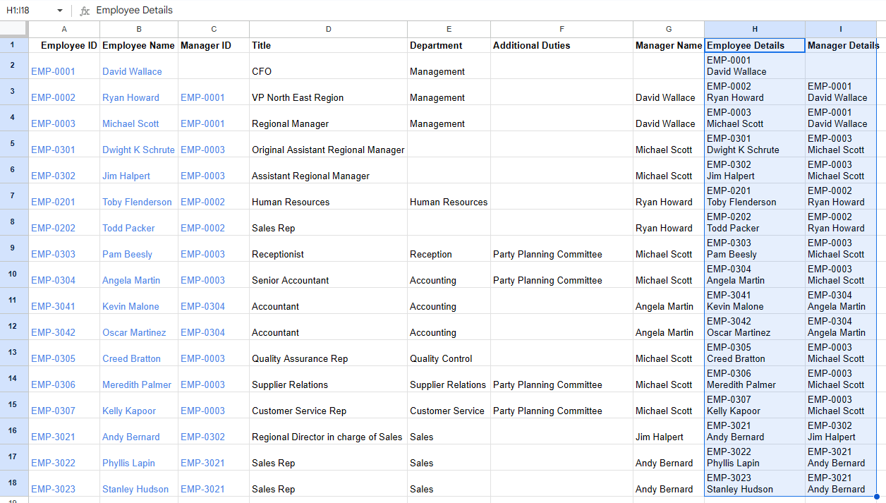
- We can now use these two new columns for
IDandParentmapping
- There! The org chart now looks like what we set out to do!
- As you can imagine, you can easily extend this technique to add additional details such as Title and Department provided you do the same for the Manager as well. Here’s an example org chart with more details (steps for this are not included - its a repetition of the above - drop us a note if you would like to know how to do this) -

Common Questions, Problems with workarounds and solutions for Google Sheets Org Charts
The Google Sheets Org Chart solution helps in some ways to create a basic org chart. With some of the tips above, you can make the data a little richer. However, it is quite limited in what it can support. We cover some additional aspects of Org Charts and how they are either supported natively or via a workaround in Google Sheets.
Updating the Org Chart
Google Sheets automatically expands the data range if you add new rows so your chart auto updates. This is very cool.
Org Chart too wide
There is no good solution to this because Google Sheets always draws the whole chart fully expanded. There are a few things you can try though.
- Make a Small chart You have the choice to Customize the chart from the ‘Edit Chart’ panel. There you can select a small option to see a more compact version of the Org Chart.
- Show the chart in its own sheet You can show your chart in its own sheet where it will occupy the whole space of the sheet. You can access this option from the top right menu of the chart
- Download You can download the chart and then view it in the browser which will allow you to zoom in and out of the image.
Collapse Nodes
There is no option to collapse nodes in the chart - the chart is always shown fully expanded. One possible workaround you can apply is -
- Apply a Filter on all the column of your employee data
- e.g. Filter the Department column - Remove Reception from the selected list
- The chart will update to now exclude employees that were filtered out reducing the size of the chart
This could allow you to manage the chart better. This is not an ideal solution by any means though.
Navigating the chart
There is no good option to navigate the chart. The chart is rendered statically and fully expanded. You cannot pan or zoom with the mouse. There are no scroll bars. There are a couple of workarounds -
- Expand the chart fully so your entire org chart is visible in the chart - you can then scroll around and pan - however, depending on the size of the chart, this may or may not be practical. Also if the chart changes, you may have to adjust the size again.
- Download the org chart to image or svg You can export from the top-right menu on the chart itself. You must expand the chart fully before you perform the download. Open the png/svg in a browser. You should now be able to zoom in and out and pan around. Try opening this in a new tab -
Again, this is a way to manage the limitation and not an ideal solution.
Changing Look
Google Sheets provides a couple of options to change the look of the chart - specifically the node background and the text color. You cannot format much else. You can access these options from Customize from Edit Chart.
Embed into a website or Google Slides
The export option as an image or as an svg allows you to embed your org chart into a website or into a presentation deck such as Google Slides. This is a nice option.
OrgNice Org Chart Creator - an alternative to the Google Sheets Org Chart
The native chart capabilities for Org Charts in Google Sheets are severely limited. An Org Chart creator software will go a long way in addressing the limitations and making it significantly easier for you and your team members to consume Org Charts. OrgNice is an Organizational Chart Creator specifically for Google Sheets. It solves a lot of the problems and makes it much easier to create an org chart. Here’s what the same data looks like in OrgNice’s Org Chart for The Office.
OrgNice can
- automatically create the chart by analyzing your data
- automatically keep the chart updated as data changes
- create a rich chart viewer that allows you to navigate the chart easily including very large charts
- keep your data secure - your data is never copied over to our servers
- share the org chart securely or publicly
- embed the org chart wherever you may need it - in web-sites, wikis or even inside a Google Sheets file.
Try OrgNice’s Organization Chart for Google Sheets to discover a much easier way to build Org Charts!
Feedback
If you have any comments/questions/feedback please reach out to us!
Learn Mode About OrgNice
Ready to build your own automated org chart? Try OrgNice with your Google Sheets today — it takes just a few clicks and keeps your charts always current. Learn More